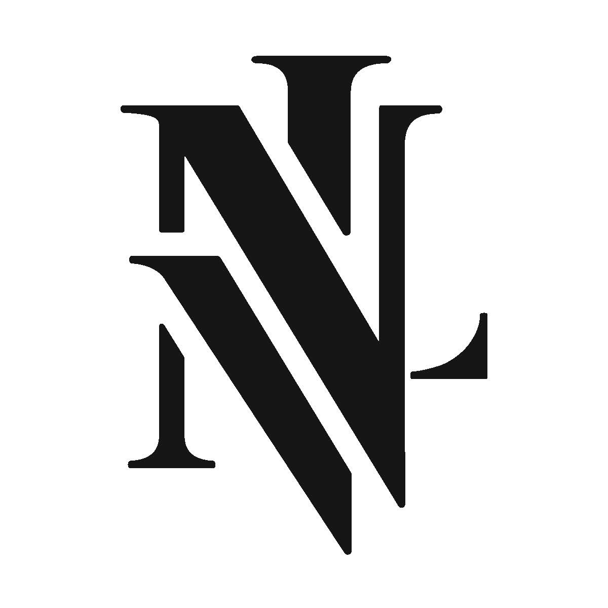
For our typography class, we were assigned with a classic project: make a serif and sans-serif monogram of our own initials. My initials are LVN, which proved to be a challenge!
For my sans-serif monogram, I wanted to go with something visually engaging and unique. My serif monogram would be more classically inspired.
Comments/critiques are always welcome!
Completed in Fall 2016.

Some exploration I did before reaching my final product. My serif monogram was thrown in the file as inspiration for my other forms.


My serif final! This one played heavily off of the diagonals in the N and the V. Although it's not quite as readable, I really loved the interest of the final form of this monogram.
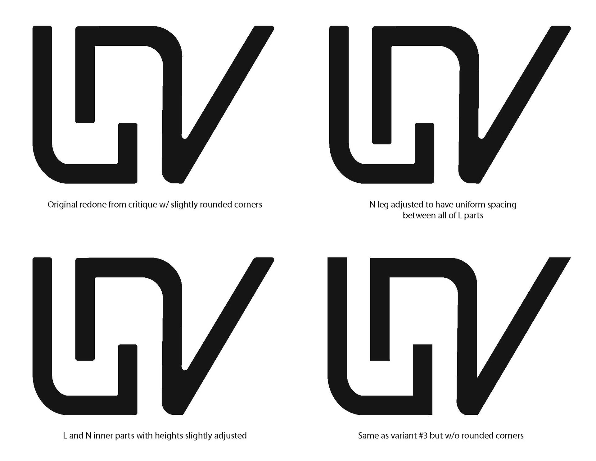
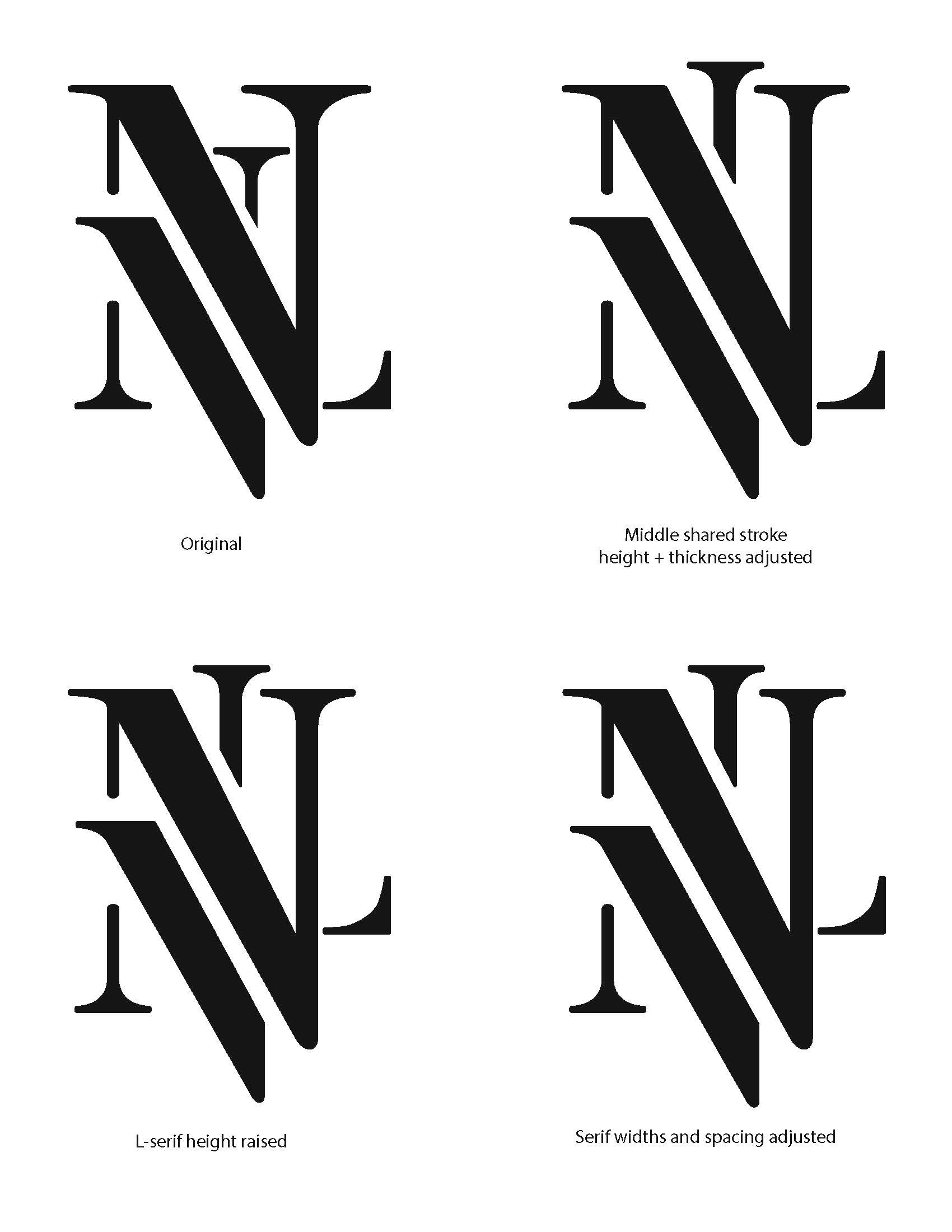
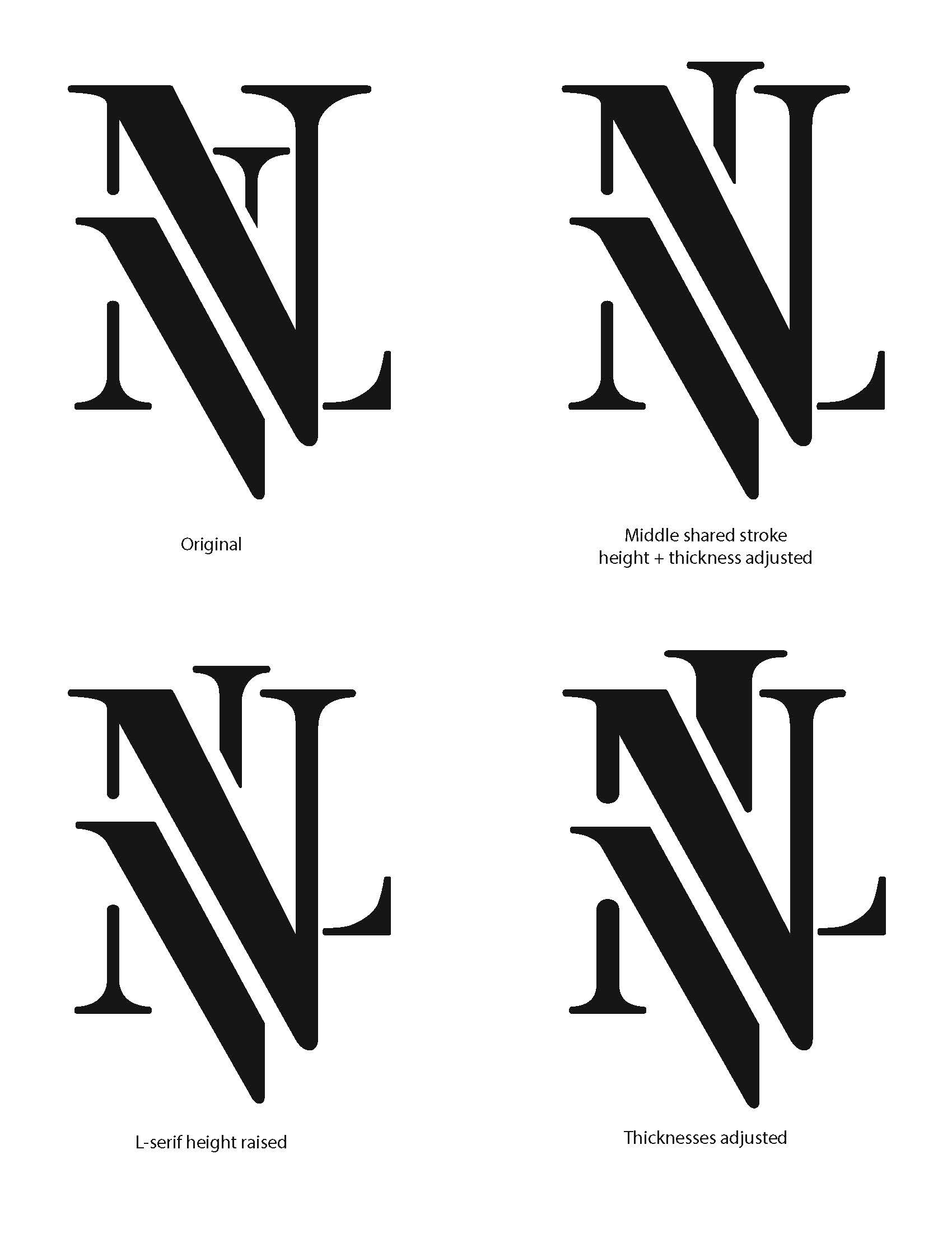
Some exploration and variations I had of my serif final.
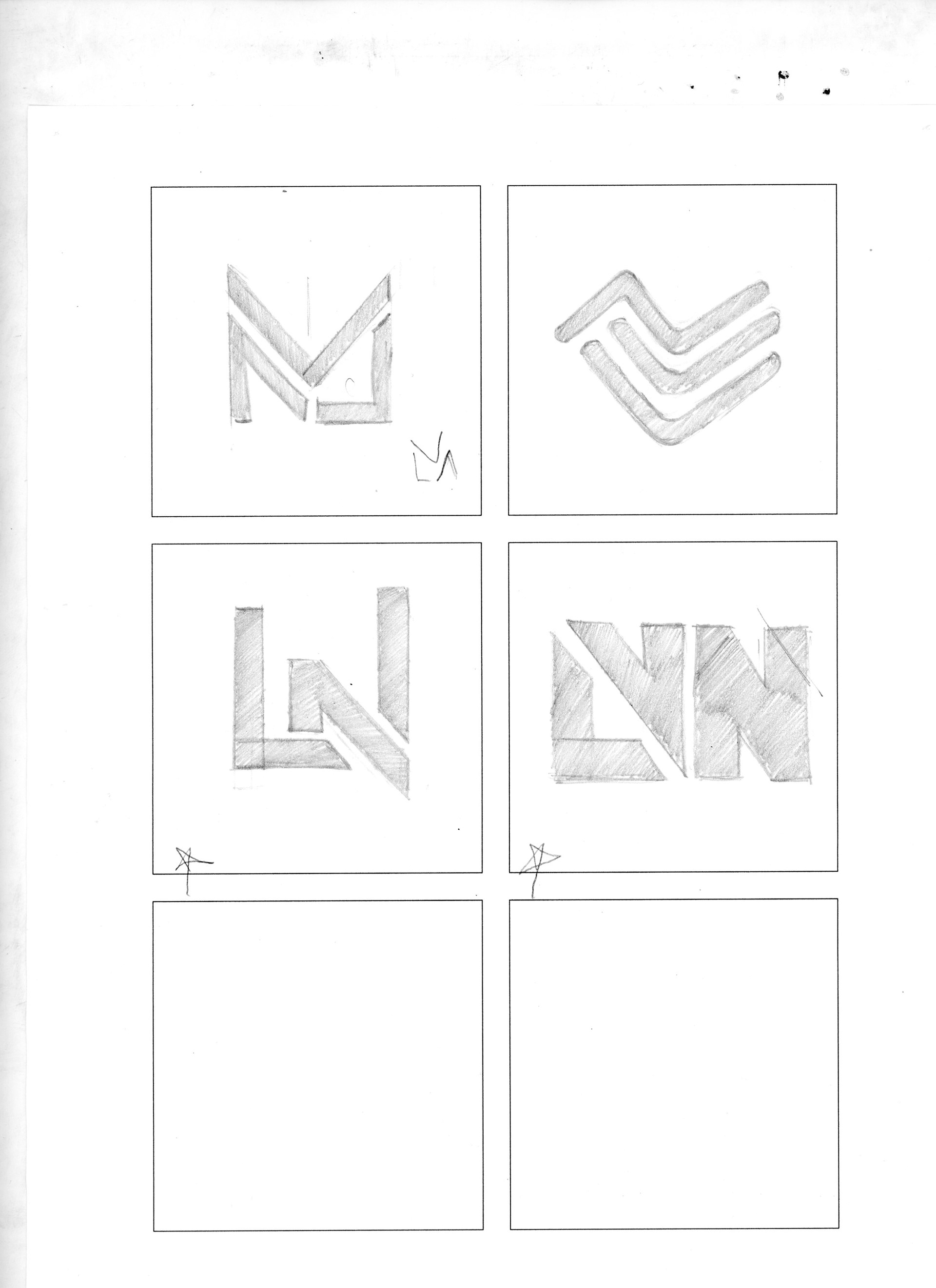
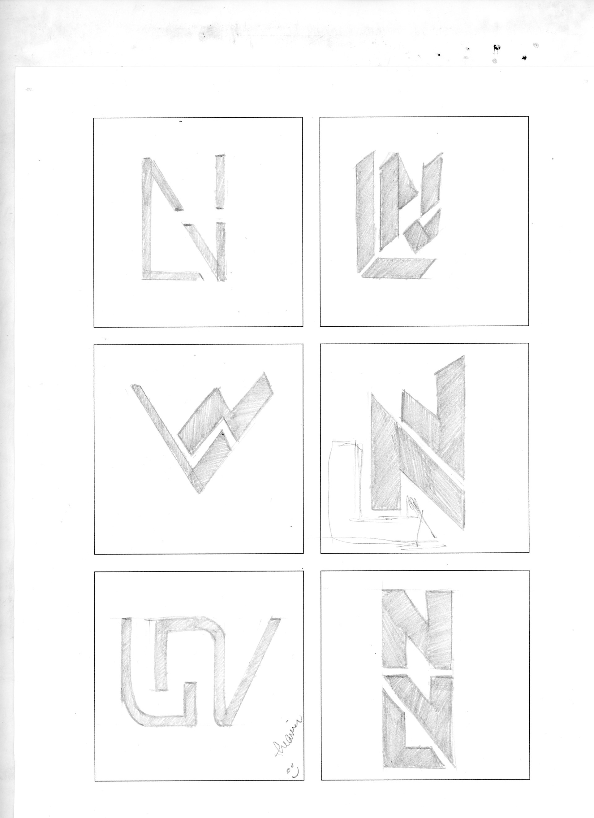
Explorative sketches I had of my monograms. I have more, and will need to scan & upload them.