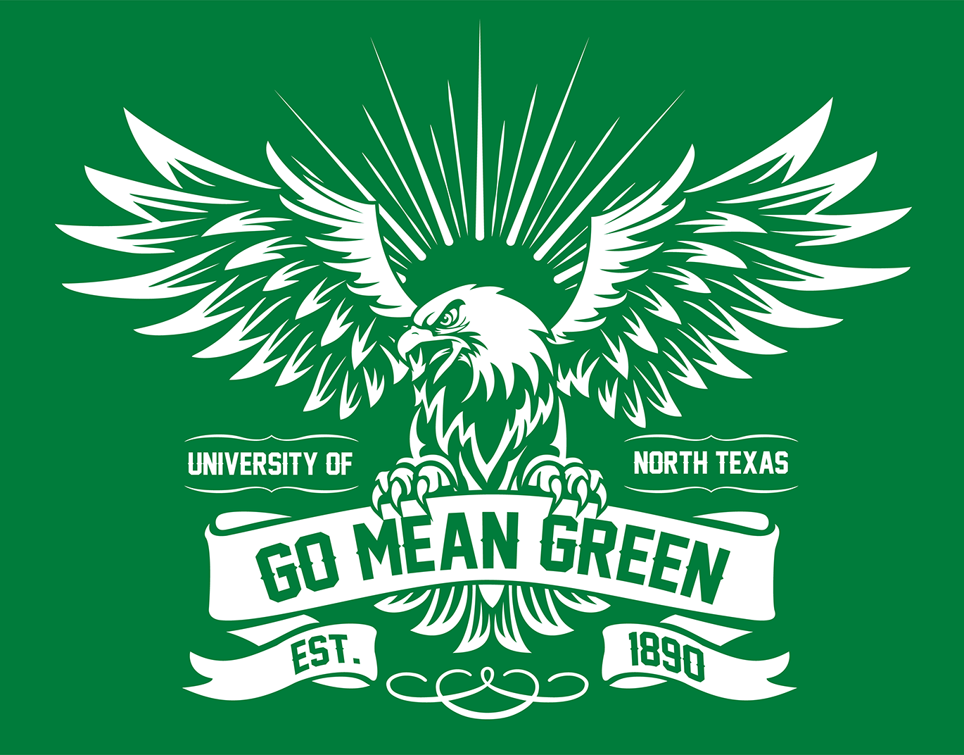
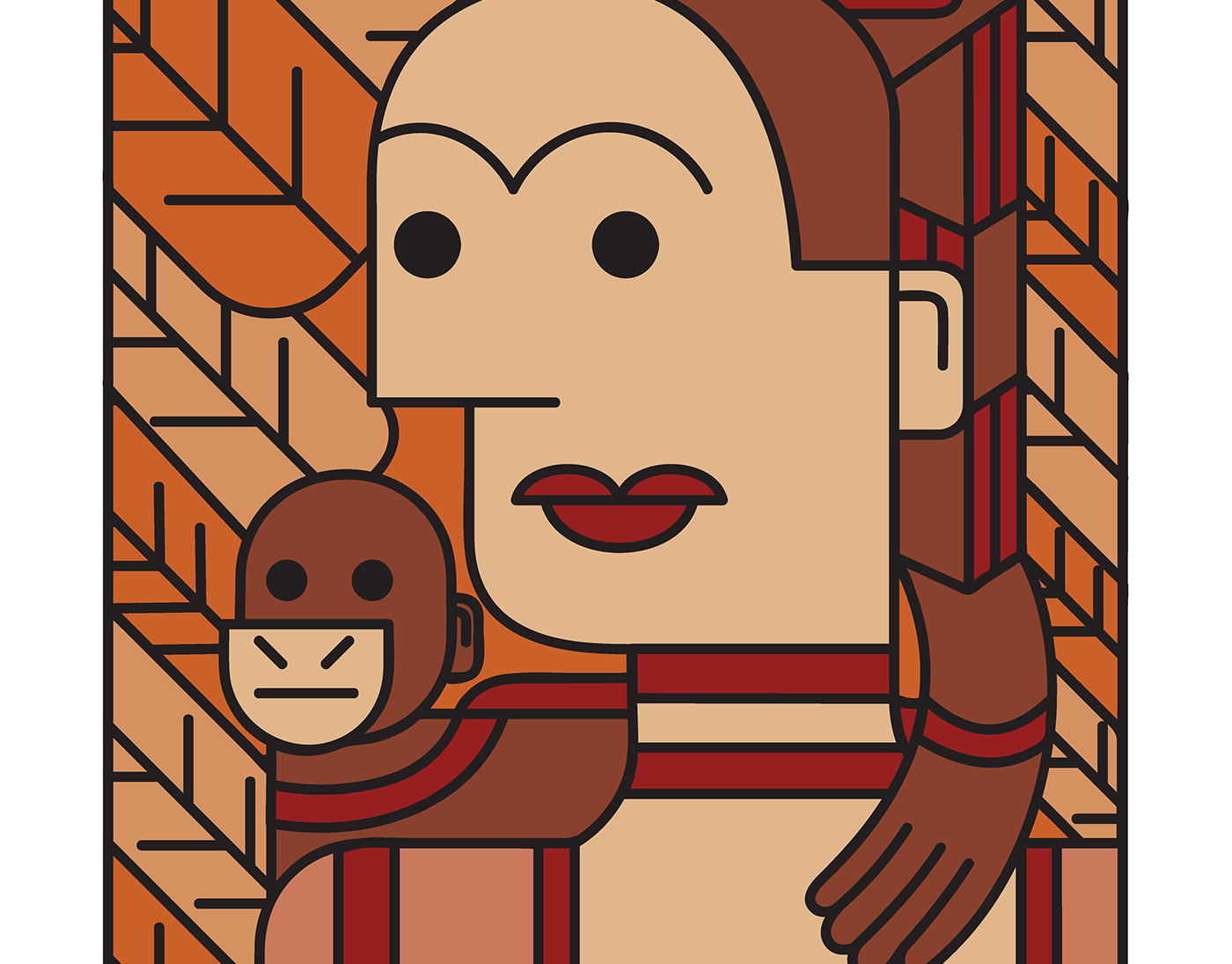
UNT Homecoming 2018 T-Shirt Design
A tattoo & vintage inspired eagle carrying a banner done for UNT Homecoming 2018. The design is white & was printed on green t-shirts.
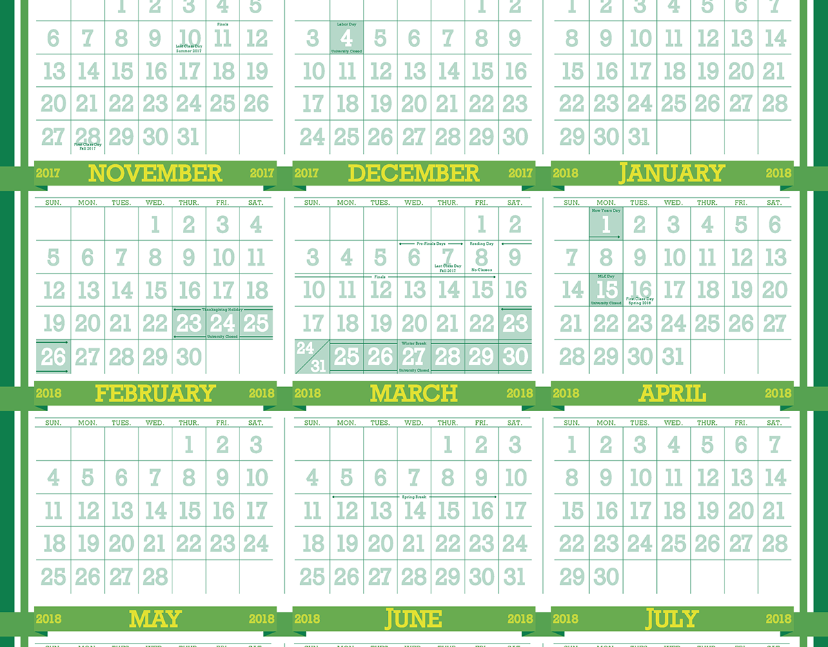
Prospective UNT 2017-18 Academic Calendar
A prospective, but unused calendar design I created for UNT's Printing & Distribution Solutions dept. for the 2017-18 Academic school year.
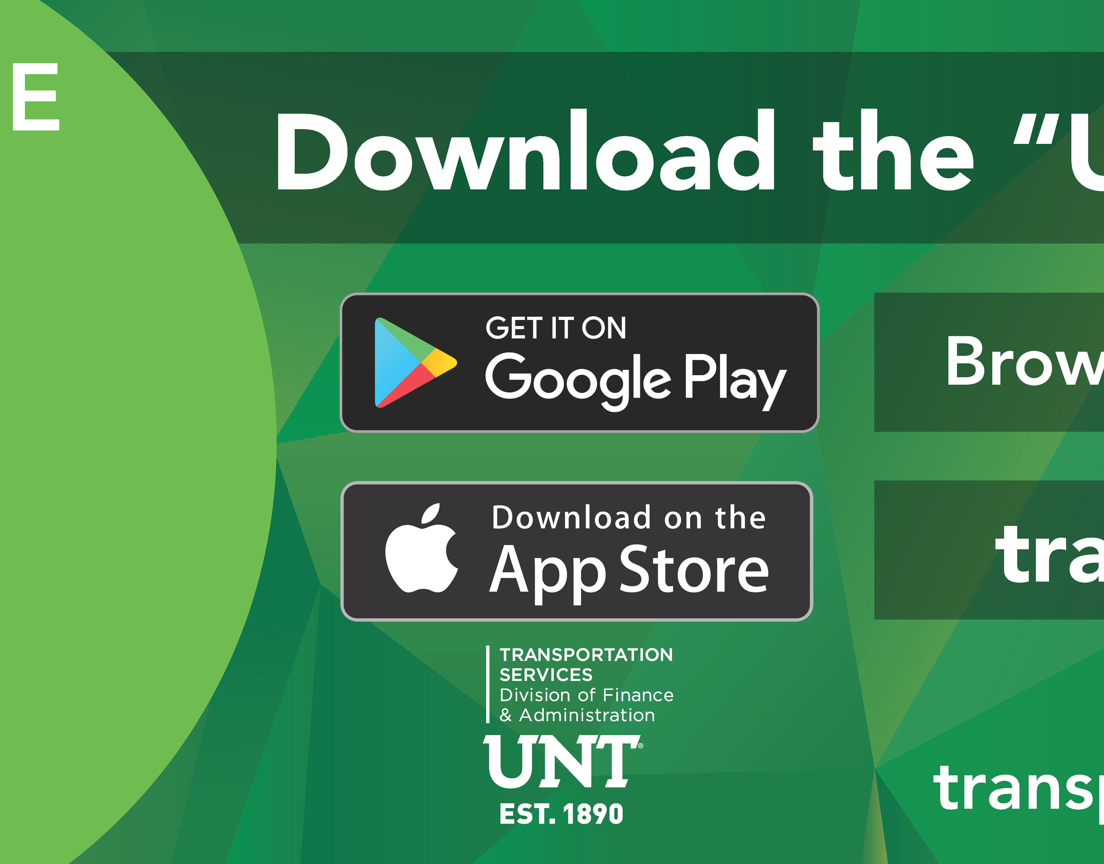
UNT Bus Tracker Car Graphics
A simple, easily readable banner made for the University of North Texas advertising their mobile app & website for tracking the campus buses.
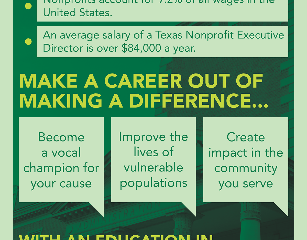
Pop-up Banner for UNT Dept. of Public Administration
An eye-catching, infographic-styled university-based banner created for UNT's College of Health & Public Service. . The banner would be displayed wherever presenters from the department would have a table or booth.
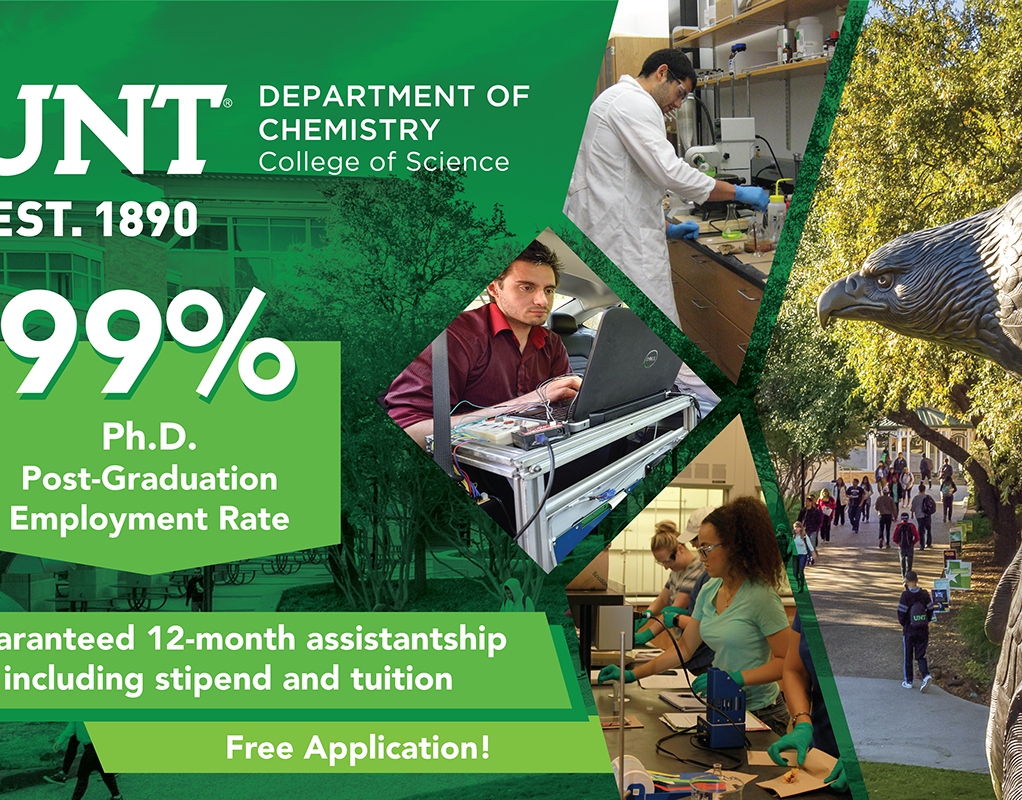
Fabric Banner for UNT's Department of Chemistry
A forward-thinking, university-based banner created for UNT's Dept. of Chemistry. The banner would be displayed wherever presenters from the department would have a table or booth.
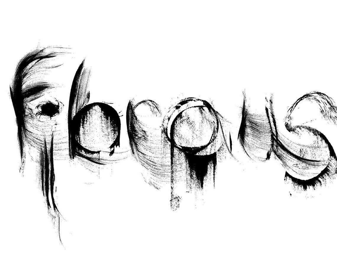
Experimental Type
Letter forms and words created from incidental marks. The words had to visually evoke their meaning.
Completed in Fall 2016.
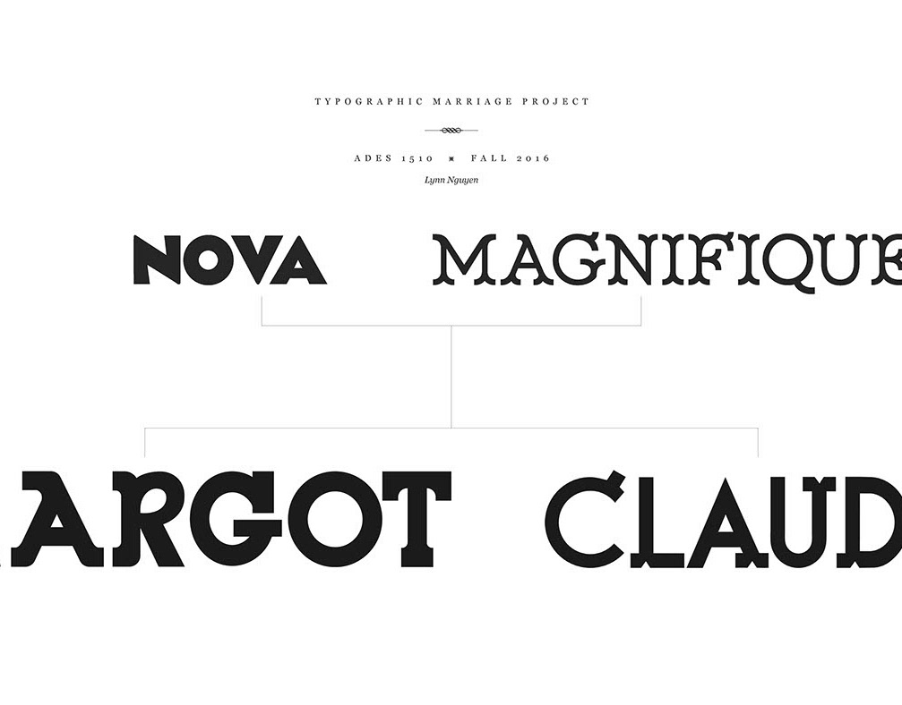
Typographic Marriage Project
A project exploring the subtle visual nuances of typefaces through a forced combination of 2 disparate typefaces.
Completed in Fall 2016.
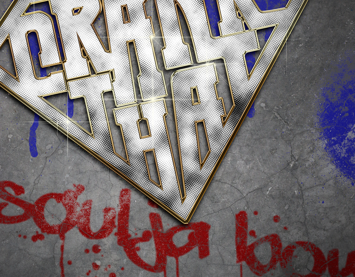
Crank That Soulja Boy Mock Poster
Mock concert poster for "Crank That Soulja Boy" completed for my typography class in Fall 2016.
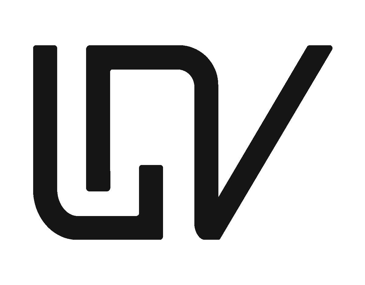
LVN Personal Monograms
Personal monograms for myself using the letters LVN. Serif and sans-serif variations are featured.
Completed in Fall 2016.
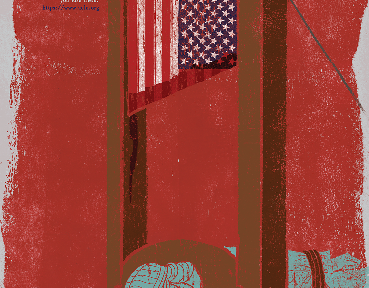
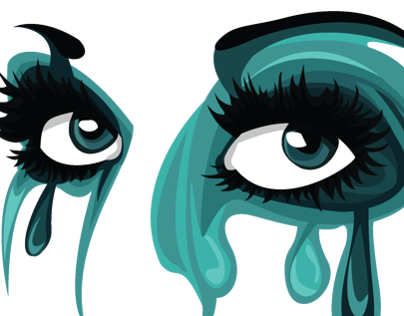
America? 2016
A poster created using both illustrative and digital processes that critiques America's current state of affairs.
Completed in December 2016.
Frida Kahlo in the Style of Richard Lillash
Frida Kahlo stylized in the angular and expressive collage style of Richard Lillash.
Done in October 2016.
Frida Kahlo Geometric Design
Frida Kahlo re-imagined in the geometric style of Studio Muti.
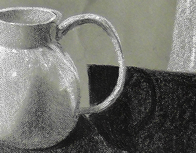
Conte Still Life
A project I did for my Drawing 1 class at the University of North Texas in March 2014. A project testing our ability to observe shadow and light, as well as build up value. Our required materials were a neutral grey sheet of Canson Mi-Tientes and black and white conte crayon.
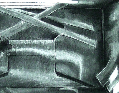
Shadow Box
A project concerning light studies that I completed for my Design 1 class in March 2014. We were told to retrieve a box of some sort, about the size of a cracker box or so. We were then instructed to cut the box in interesting ways so that light would come in. Finally, we had to illustrate what we saw in the box. We were allowed any black or white medium, and I selected charcoal.
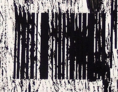
Data
An incidental line project that was assigned to me in my Design 1 class at the University of North Texas in January 2014. To create incidental lines, we were allowed to do any sort of motion/use any sort of object with black paint and just let the lines "happen." This piece was done with 2 forks and my friend and I wildly beating and scratching the paper with them. Afterwards, we were told to "accent" the piece or recreate it with black paper. I created the barcode pattern in the middle to highlight the almost barcode patterns created by the forks. I then added some vertical lines to the top and bottom corners in order to highlight the imperfect straightness of the marks created by the forks.
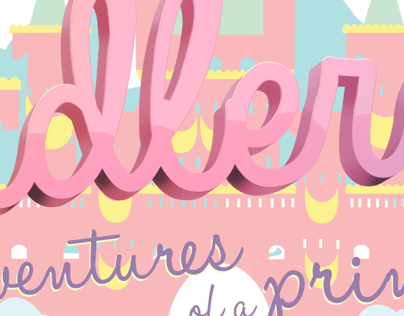
Banner for Noodlerella
A banner created for a client whose online personality is named "Nooderella." She requested to have it be cute, use a pastel color palette, and feature the words "Adventures of a Princess."
I'm quite pleased how this turned out! I was very ill during the process of creating this whole banner, so I was glad when I could complete it. Her banner can be viewed on her blog, YouTube, and Facebook featured in the links below:
http://noodlerella.blogspot.co.uk/
https://www.youtube.com/channel/UCxlNE1UStmCupXMn7SdY7xw
https://www.facebook.com/noodlerella
Done in January 2014.
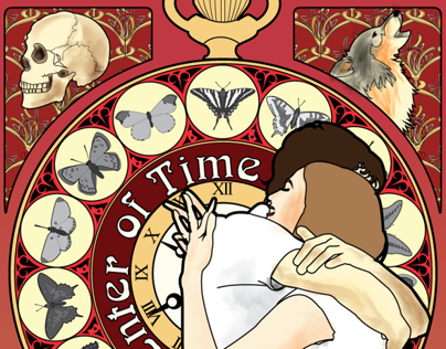
14 May 1905
My final project for my Foundations class during my semester at Kansas City Art Institute. The assignment was to select a chapter from the novel "Einstein's Dreams" by Alan Lightman and interpret it into any form of artwork. I decided to go digital with my final project because all of our earlier ones had been so sculptural and abstracted.
Several references pictures were used to create each individual part of the project, so I claim no copyright over this work.
Finished in November 2013.
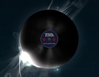
2013 TSA Promotional Graphic
Done for the Promotional Graphics event for the Technology Student Association back when I was in high school. The event's goal was to have us promote 3 chosen other TSA events in a poster form. That year, I had selected Music Production as the event I sought to promote.
Completed in June 2013.
TSA Desktop Publishing 2013
Done as part of the Desktop Publishing event for the Technology Student Association that I was part of during high school. For the 2013 year, the event's prompt was to have us create a poster, press release, and newsletter for a fictional chapter of TSA at a high school.
Finished back in April 2013.
The Muse
A piece I did of Dolly x Kuroi because I was inspired by her style and beauty. This was also done as challenge to myself to work on my creative vectoring back then and really push myself on my style. You can check out Dolly x Kuroi at her blog here:
http://dollyx.tumblr.com/ **NSFW**
Completed February 2013.
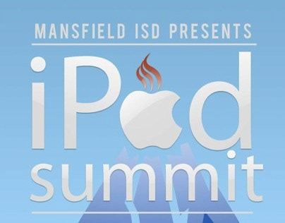
iPad Summit Poster
A poster I did for an event called the "iPad Summit" that was being hosted by my school district back when I was in high school. We were given the name of the event, date, location, and other information to put on the poster, but we were given creative leeway to how we wanted it to look. I combined the school district's logo with the Apple logo, and used the mountain as a play on the word "summit."
Completed in January 2013.
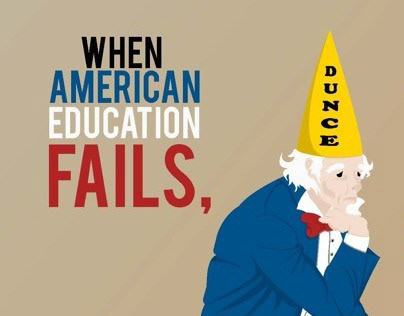
Uncle Dunce
As an assignment in my Advanced Graphic Design class during high school, we were given a news article about the failure of inner city schools in the Dallas Independent School District. We were then asked to interpret our own illustration for the article and create it using a digital medium.
Completed back in October 2012.
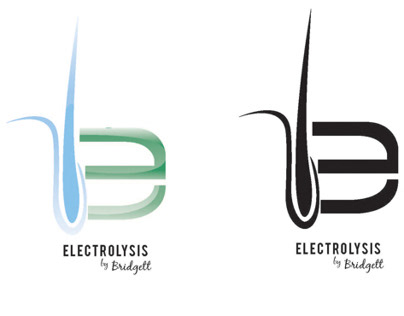
Logo Designs for Local Businesses
During my Advanced Graphic Design class in high school, we often had clients that would come by and request student work. As an assignment, my teacher would then have all of us create designs for this client, and they would pick the best designs. I had the fortune of being selected.
The clients were Bridgett's Electrolysis and Eliza Skin Care. Working as partners in the same building, both clients wanted a cool, calm refreshing design that illustrated the nature of their work. Bridgett wanted to have her logo incorporate a hair follicle in it, and asked for a green or blue color palette.
Completed in October 2012.

2012 TSA Promotional Graphic
Done for the Promotional Graphics event for the Technology Student Association back when I was in high school. The event's goal was to have us promote 3 chosen other TSA events in a poster form. That year, I had selected Biotechnology Design as the event I sought to promote.
Completed in February 2012.
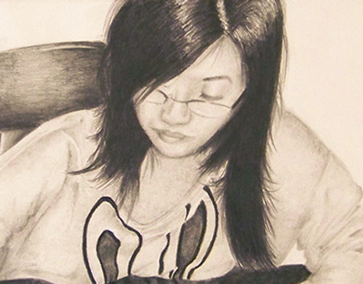
Self Portrait Circa 2012
A piece I completed as part of my AP Drawing portfolio back in 2012. A picture of myself drawing myself. Unfortunately, this was done with a reference photo rather than from life.
Completed back in January 2012.

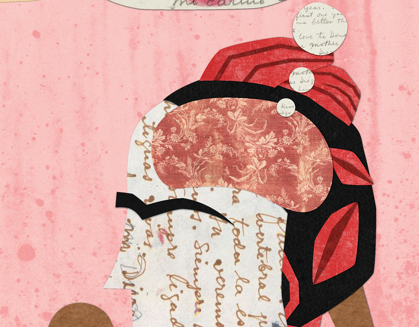
The Soldier
A piece I completed as part of my AP Drawing portfolio back in 2012. Following my concentration theme of "masks," I illustrated a WWI soldier wearing a gas mask and surrounded by noxious fumes. Although I thought I had done enough research, apparently the helmet is wrong and the uniform is slightly off for the time (according to a military junkie friend). I was really happy with how this piece turned out back then, since I didn't use harsh shading and crosshatching a lot back then.
Completed in February 2012.

Plague Crossing the Alps
A piece I completed as part of my AP Drawing Portfolio back in 2012. Using the famous piece "Napoleon Crossing the Alps" as an allusion, I used the bubonic plague as a theme instead. This is before I effectively knew how to crosshatch or use the expensive pens I was given back then. Still, I'm quite proud of it!
Completed back in January 2012.
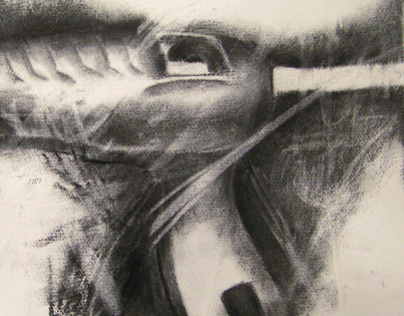
Hot Glue Gun
A piece I completed as part of my AP Drawing portfolio back in 2012. Using illustrative styles inspired by the drawings by Jim Dine, I rendered a hot glue gun in charcoal, and then distressed it using an eraser.
Completed in October 2012.
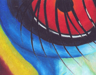
Red-Knobbed Hornbill
For my AP Drawing portfolio back in 2012. Our assignment was to cut a 1x1" square out of a magazine and then enlarge it to 6x6" via illustration. My square was a crop of a Red-Knobbed Hornbill, and I was completely fascinated by the colors and textures!
Completed back in January 2012.